Established in 1988, Ymddiried, a Welsh charity, has been pivotal in nurturing the media sector, initially benefiting from the rights of S4C’s hit animation series, Superted. Thanks to this global success, the charity has since supported hundreds of Welsh creatives, providing essential up-skilling, knowledge, and experience.
WHAT WE DID
Branding Graphic design Illustration Web design Web development WordPress CMS Managed hosting
DESTINATION
Failing to maximise grant applications, Ymddiried approached us to create a fresh, modern brand identity reflecting their commitment to supporting the Welsh media industry. They wanted an identity that would better appeal to this audience and work more effectively across applications to raise awareness and encourage applications for funding.
THE JOURNEY
We embarked on a comprehensive overhaul of Ymddiried’s visual identity, aiming to craft a modern brand image that was flexible, interchangeable, and capable of growth alongside the organisation.
Headline typeface “Tomorrow’s” geometric structure offers a contemporary feel, while its uncluttered simplicity ensures that the brand’s message is delivered with clarity and impact. Clean lines and open forms, promote readability and accessibility.
Space Grotesk combines modernity with functionality, its characterful design enhancing the brand’s distinctive voice across all communications.
Both typefaces provide excellent versatility, scaling gracefully from digital screens to large print formats without losing its legibility or charm.
Our brand guidelines provide detailed specifications for accessible colour combinations, ensuring that visual content is not only aesthetically pleasing but also fully accessible to all audiences, complying with WCAG standards. We’ve included practical examples of how the components of the brand translate to various materials, to ensure the visual identity is coherent, consistent and impactful across print and digital.
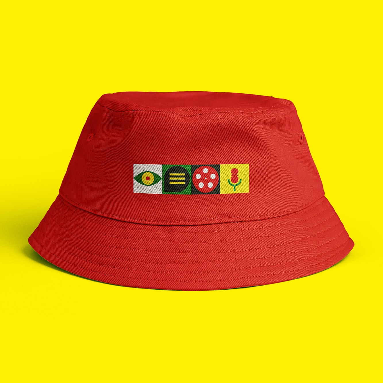
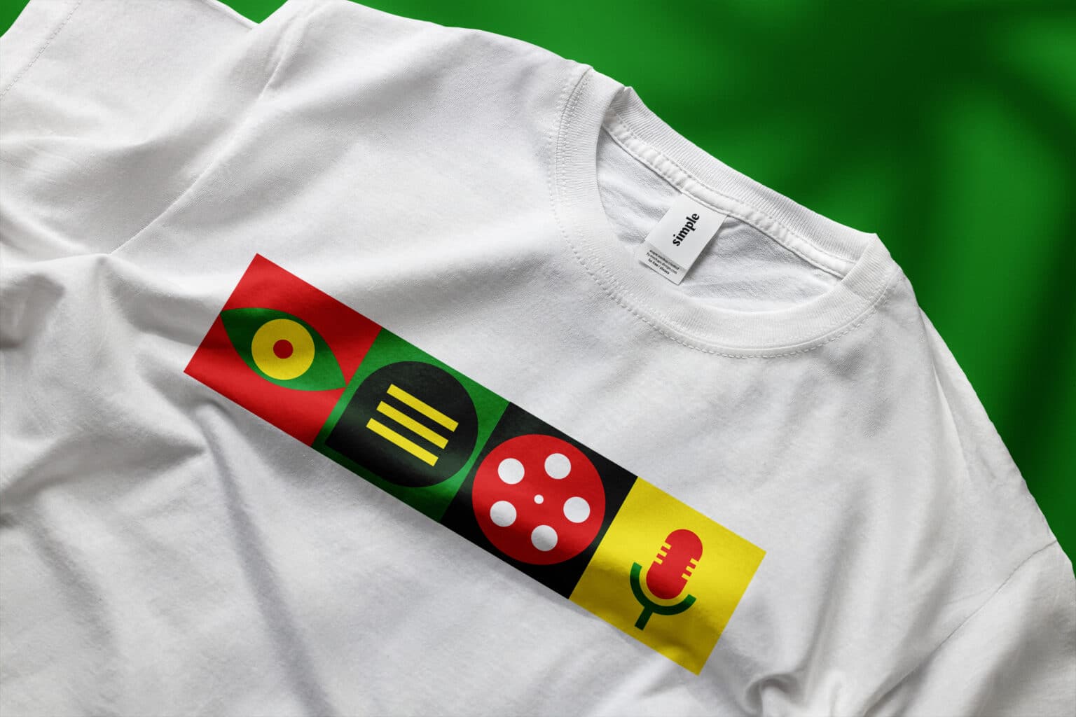
This fashion-forward piece showcases the Ymddiried new brand icons in a linear pattern, demonstrating how the new brand language can adapt to different textures and form factors. The hat has been a hit with the younger audience, ideal for wearing at outdoor events promoting brand visibility.
When applied to large format prints, the vibrant colour blocks and distinctive icons come into their own, showcasing the brand’s ability to adapt and make a bold statement across various media.
“Following an open tender, Design Tribe were appointed to re-brand and refresh the charity, and create a new bilingual website. We found them to be creative, good communicators and very easy to deal with. As the trustees are volunteers – it’s not always easy to keep a project moving. Design Tribe were flexible and adaptable, which was hugely appreciated. We’re very happy with the work they did for us and would recommend them to others.”
Modernising their whole look and feel created a vibrant and impactful visual identity for Ymddiried that better appealed to a youthful audience, works across media touch points, and includes flexibility to expand upon in the future. Applications have nearly doubled since the rebrand was launched.
Would your organisation benefit from modernising its’ brand? Get in touch and we will help you realise your vision.
Looking for help with your next design adventure?