The UK government spent £500k refreshing the GOV.UK brand, but critics are missing the real story. We explore what changed, why it matters, and what smaller organisations can learn.
The UK Government recently rolled out a refreshed brand identity for GOV.UK — and revealed it cost £500,000.
Cue the outrage.
“Civil servants spend £500k on new GOV.UK logo” said LBC. “Looks the same!” came the social media replies. “A colour bar? Really?”
But this kind of backlash misses what brand evolution is actually for — especially in the public sector, where clarity, trust and usability are everything.
This wasn’t about a logo. It was about improving how millions of people experience government services — from tax returns to benefits to passports.
What actually changed?
The updated identity is subtle by design — but it’s far from cosmetic.
The rebrand included:
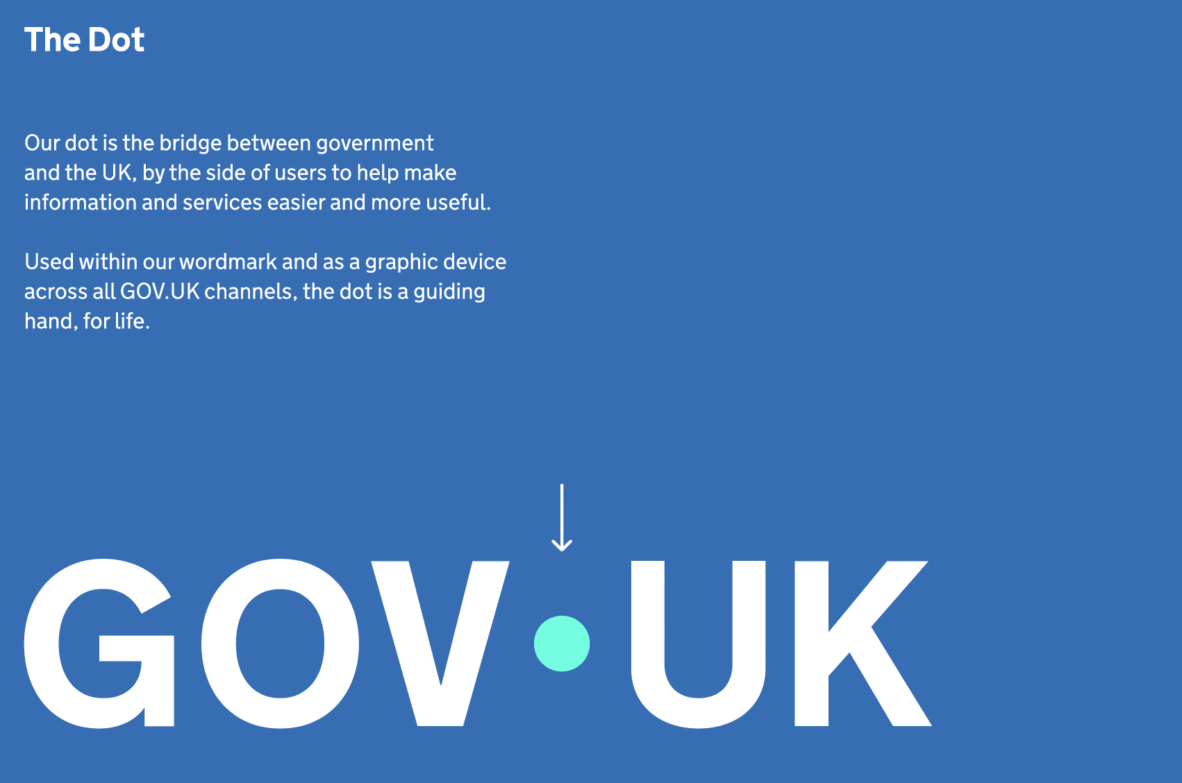
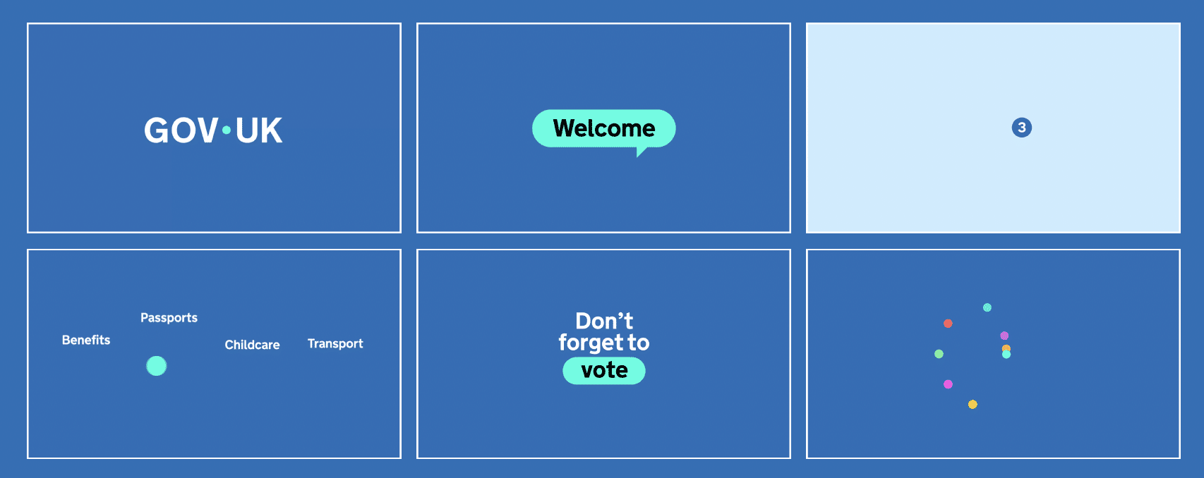
A more accessible logotype
Better flexibility for long department names and sub-brands
A simplified colour system for digital use and print consistency
Updated layout guidance for real-world implementation
Improved typographic standards for mobile and screen reading
A full update of GOV.UK’s brand guidelines
A transparent, open-source design system available on GitHub
As the official brand guidelines put it, this work supports “consistent and clear presentation of GOV.UK and government departments to the public.”
This wasn’t a new look. It was a foundation for long-term clarity.
GOV.UK isn’t a campaign. It’s infrastructure.
The GOV.UK website supports more than 2,000 services across hundreds of departments and bodies. It’s not a marketing site — it’s a critical piece of public infrastructure used by millions every day.
A coherent, flexible brand system helps ensure:
Consistent design across a vast range of teams and outputs
Fewer mistakes, faster delivery, and less duplicated effort
Increased trust from the public
Better accessibility for people with visual impairments or cognitive needs
These may not be headline-grabbing changes, but they’re vital. Because when branding fails at this scale, the results are confusing, inaccessible, and inefficient.
But was it worth £500k?
In context? Yes.
This wasn’t £500k for a logo. It was for a multi-year project to clarify, codify, and modernise a design system that touches every part of government communication – and, by extension, public life.
Think of it this way…
A good brand system isn’t a nice-to-have. It’s the foundation of how services are experienced.
So rather than ask “Was this worth it?”, we should be asking “What’s the cost of not doing this properly?” (Brand inconsistency, public mistrust, accessibility failures, slow delivery — to name a few.)
Lessons for smaller organisations
We get it. Our clients aren’t spending £500k(!)… and they don’t need to.
But they’re still dealing with:
Messy, inconsistent materials across teams
A logo that doesn’t work at small sizes or across digital formats
Difficulty staying aligned when multiple people are creating content
The growing pain of needing to look more joined-up, more credible, more trustworthy
A brand refresh doesn’t have to be big or flashy. It just needs to work.
And like the GOV.UK project, it should be:
Built with flexibility in mind
Designed to scale as your organisation grows
Accessible and inclusive by default
Clear enough for your whole team to use — and for your audiences to trust
If that sounds like something you need, we can help.
What makes this refresh different?
One of the most impressive aspects of the GOV.UK rebrand is how openly it’s been done. Anyone can:
Reworking your brand for accessibility and consistency
Creating flexible templates your team can actually use
Helping you feel proud (and in control) of how you present your organisation
Refreshing your identity to reflect who you are now — and where you’re heading
Whether you’re dealing with stakeholder confusion, accessibility issues, or just a brand that no longer fits, we help you move forward with clarity and confidence.