Sharper colour, bolder type, brighter packs and a memorable jingle.
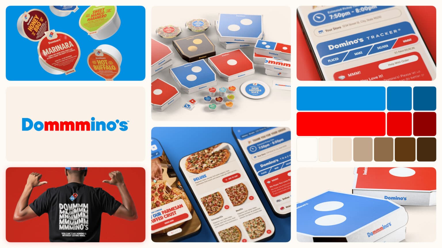
Thirteen years after its last update, Domino’s has revealed a new brand system that sharpens colour, typography and packaging, adds a playful “Dommmino’s” jingle voiced by Shaboozey, and rolls out across the US over the coming months. The company is clear about the intent: refresh from a position of strength, not as a rescue job.
What changed
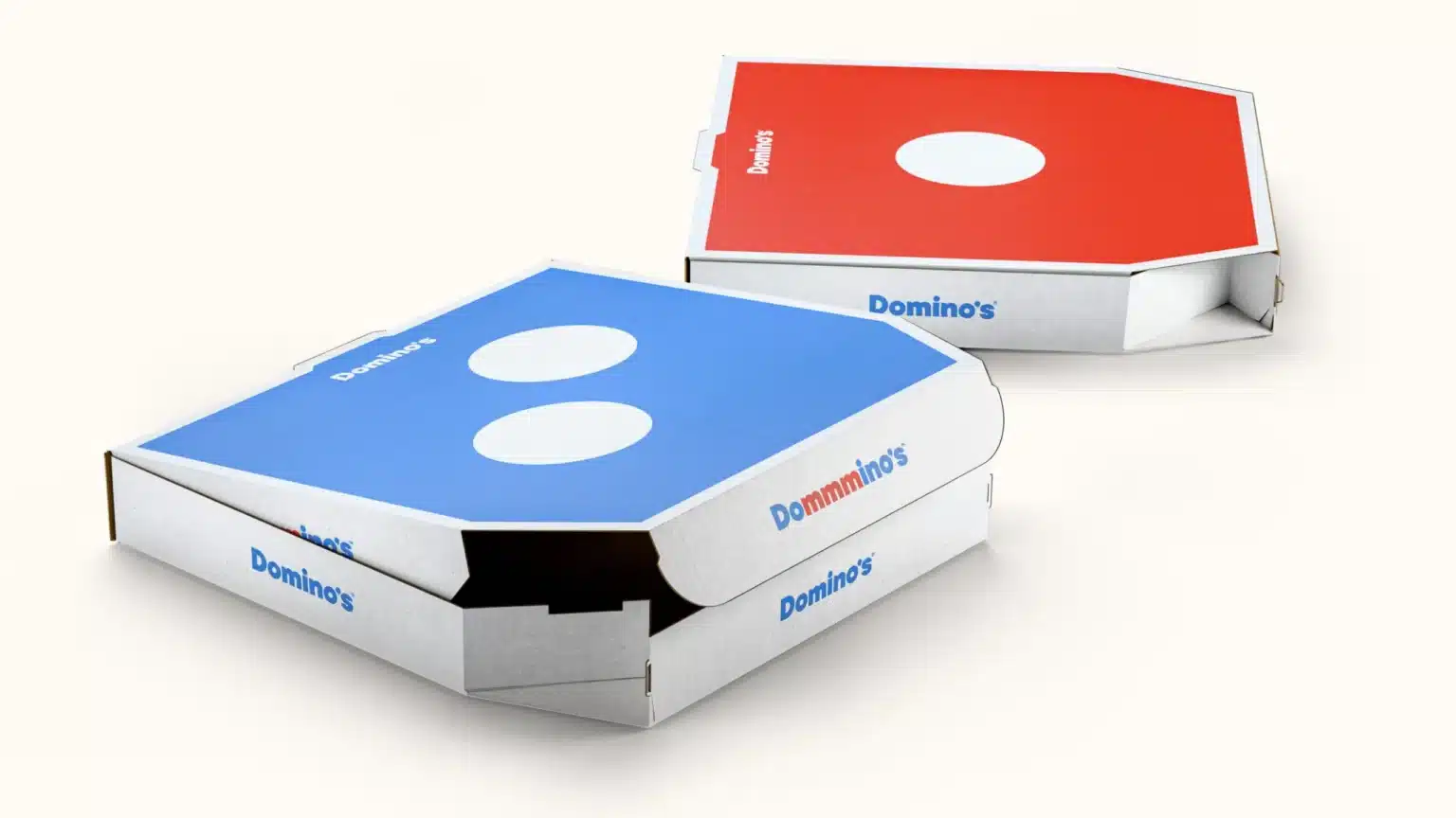
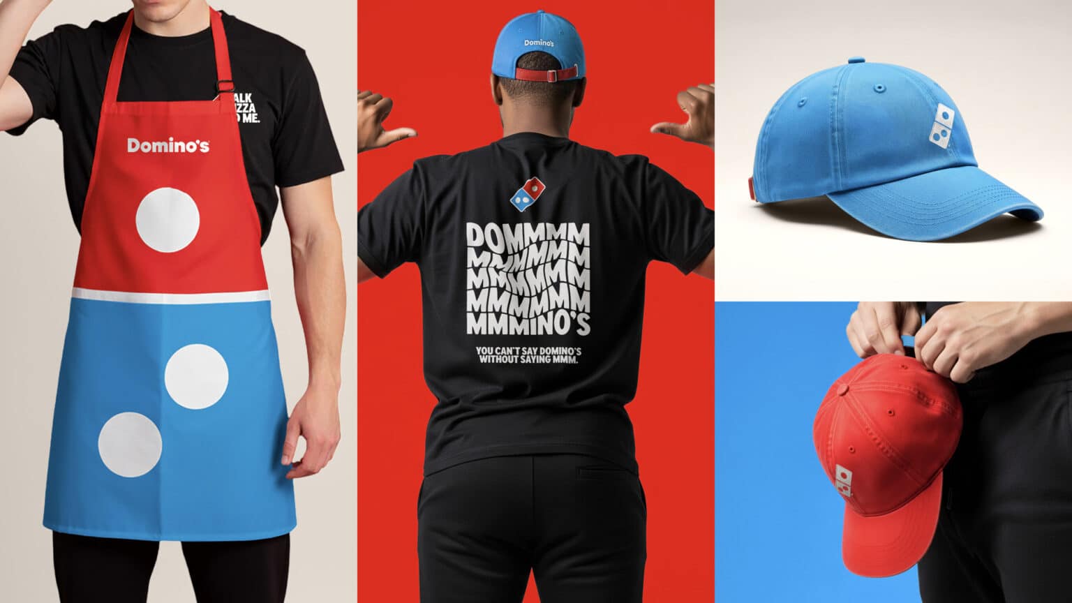
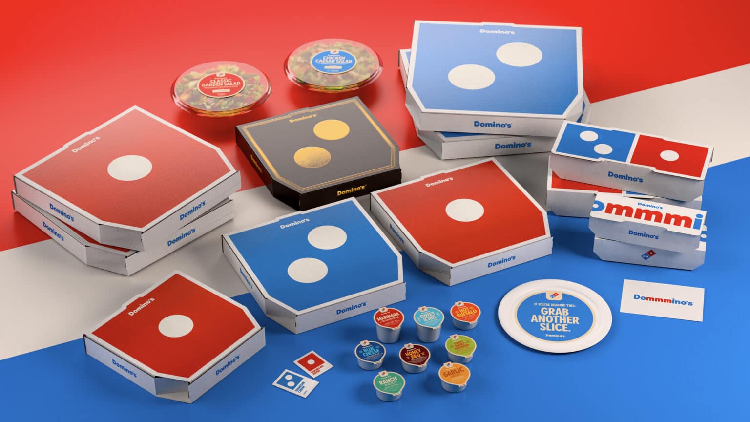
Hotter red and blue, bolder type, brighter packs. A more vibrant toolkit across touchpoints.
Sonic identity. A new name-bending jingle designed to be instantly hummable.
System first, stores later. Core assets and packaging lead, with spatial updates expected after the initial launch period.
Why it matters
Domino’s is framing the move as a lesson in momentum: there’s risk in doing nothing. Waiting for performance to dip before modernising means playing catch-up. Refreshing while things are going well lets a brand set the pace, test confidently and avoid heavy-handed change.
What we can learn (and apply)
Refresh the system, not just the logo. Colour, typography, motion, sound and packaging all work together. Updating the full brand toolkit creates consistency and avoids a “new badge, old brand” feel.
Use sound to boost recall. A simple mnemonic can do as much work as a visual mark, especially in short-form video and delivery apps.
Roll out where customers feel it most. Packaging and digital get the first wave because that’s where the brand meets people most often. Stores follow after learning what lands.
Research before you reveal. Domino’s validated the direction with testing, then launched quickly and will iterate. That’s a healthy pattern for any refresh.
Keep the core equities. The domino icon and red-blue world remain. The brand feels new without losing recognition.
Our take
This is a good example of evolution over reinvention. The visual updates are confident, the jingle is sticky, and the rollout plan is pragmatic. For organisations in energy, life sciences, charity or public sector, the lesson is simple: you can modernise without confusing people. Keep the equities, modernise the system, and roll out where it matters. If you’re weighing a refresh, discuss your brand or see our branding work.