Lamplight is a UK-based CRM software provider for charities and non-profits, helping them manage casework, track outcomes, and demonstrate impact, especially in sectors like youth, housing, and mental health.
WHAT WE DID
Brand evolution Visual identity & guidelines WordPress design & development Managed hosting UX & content structure Illustration system
DESTINATION
Lamplight’s platform was strong — but their brand and website weren’t telling the full story. We helped them evolve their identity, clarify their messaging, and build a modular new website that reflects who they are: supportive, capable, and charity-focused.
JOURNEY
Through brand workshops and messaging development, we repositioned Lamplight as not just a CRM, but a trusted partner to small charities. Warmth and clarity replaced corporate tech-speak.
That thinking shaped the new brand identity and a bespoke WordPress site—modular, easy to manage, and built to speak directly to different charity sectors.
After 20 years supporting the charity sector, Lamplight had built a trusted name with strong recognition. There was no need to start from scratch — but with rising expectations and growing competition, it was time to evolve.
The goal wasn’t reinvention, but refinement: a modern identity that reflects who they are today, while preserving the equity built over two decades. It was about helping them stand taller, speak more clearly, and continue to lead in a sector they’ve supported since day one.
Redesigned for clarity, with a spark of character
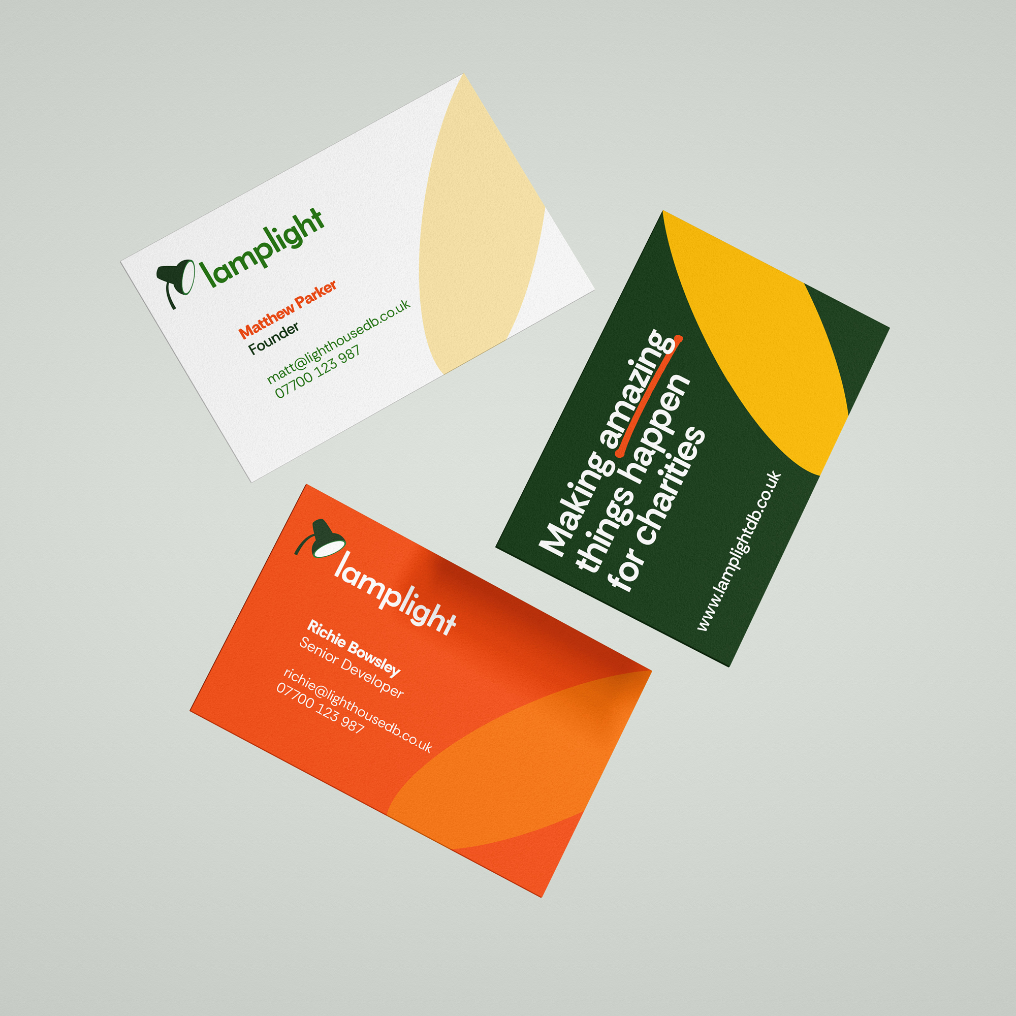
The new Lamplight logo introduces a softer, more modern wordmark paired with a carefully refined lamp icon. Subtle, distinctive, and full of quiet charm. By linking directly to the name and mission, the new mark balances professionalism with approachability, bringing clarity and warmth to every application.
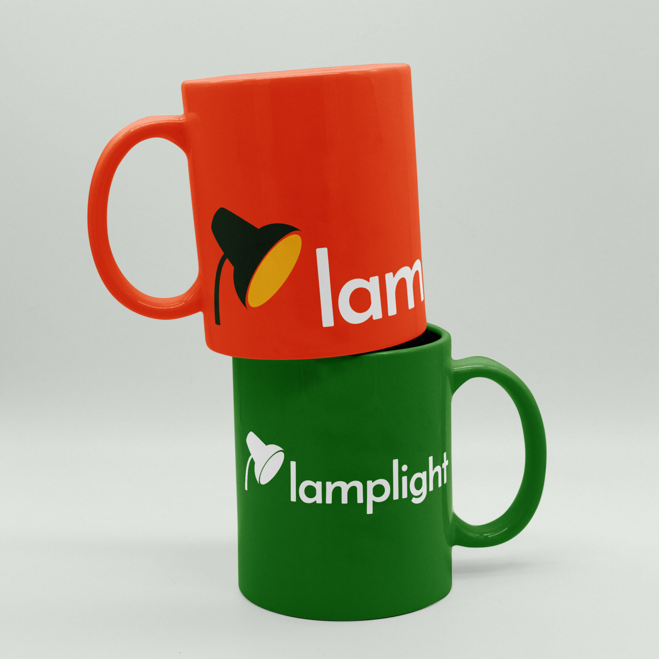
Simple to use, strong in effect
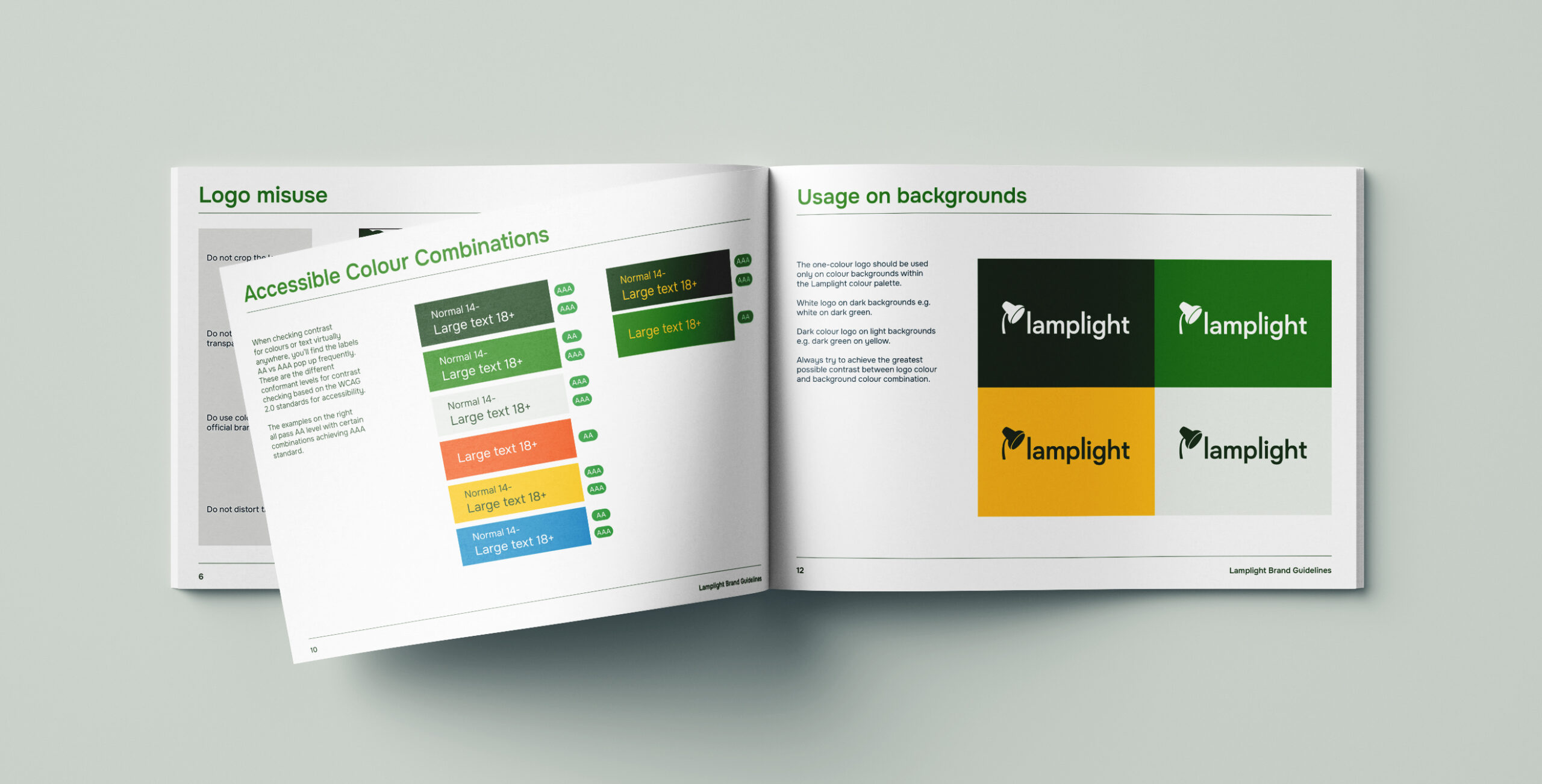
The evolved identity is simple, distinctive, and easy to apply; making it ideal for use across real-world touchpoints like printed materials, merchandise, and digital platforms. An accessible, flexible system of colour, type, and layout ensures the brand remains recognisable and coherent, wherever it appears.
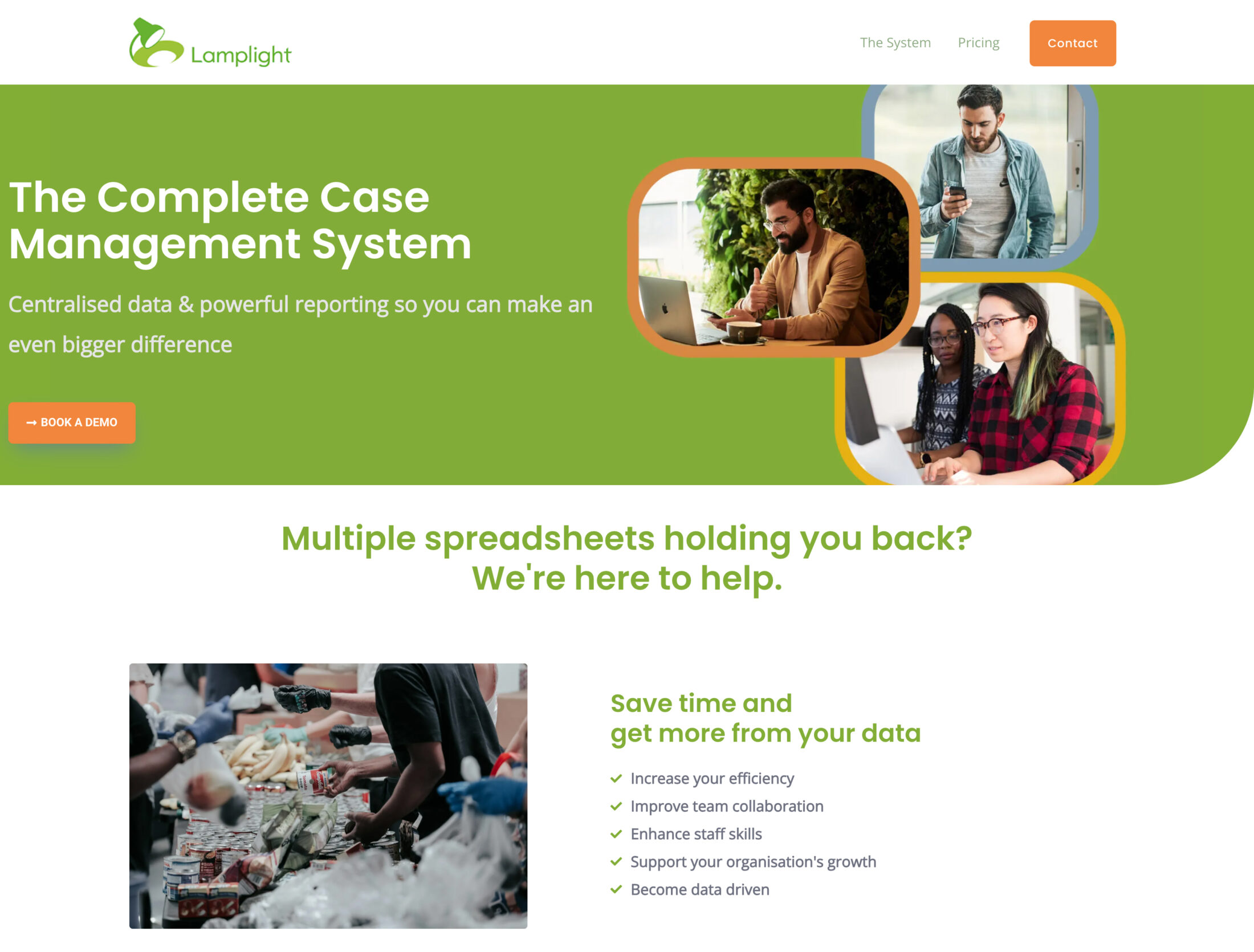
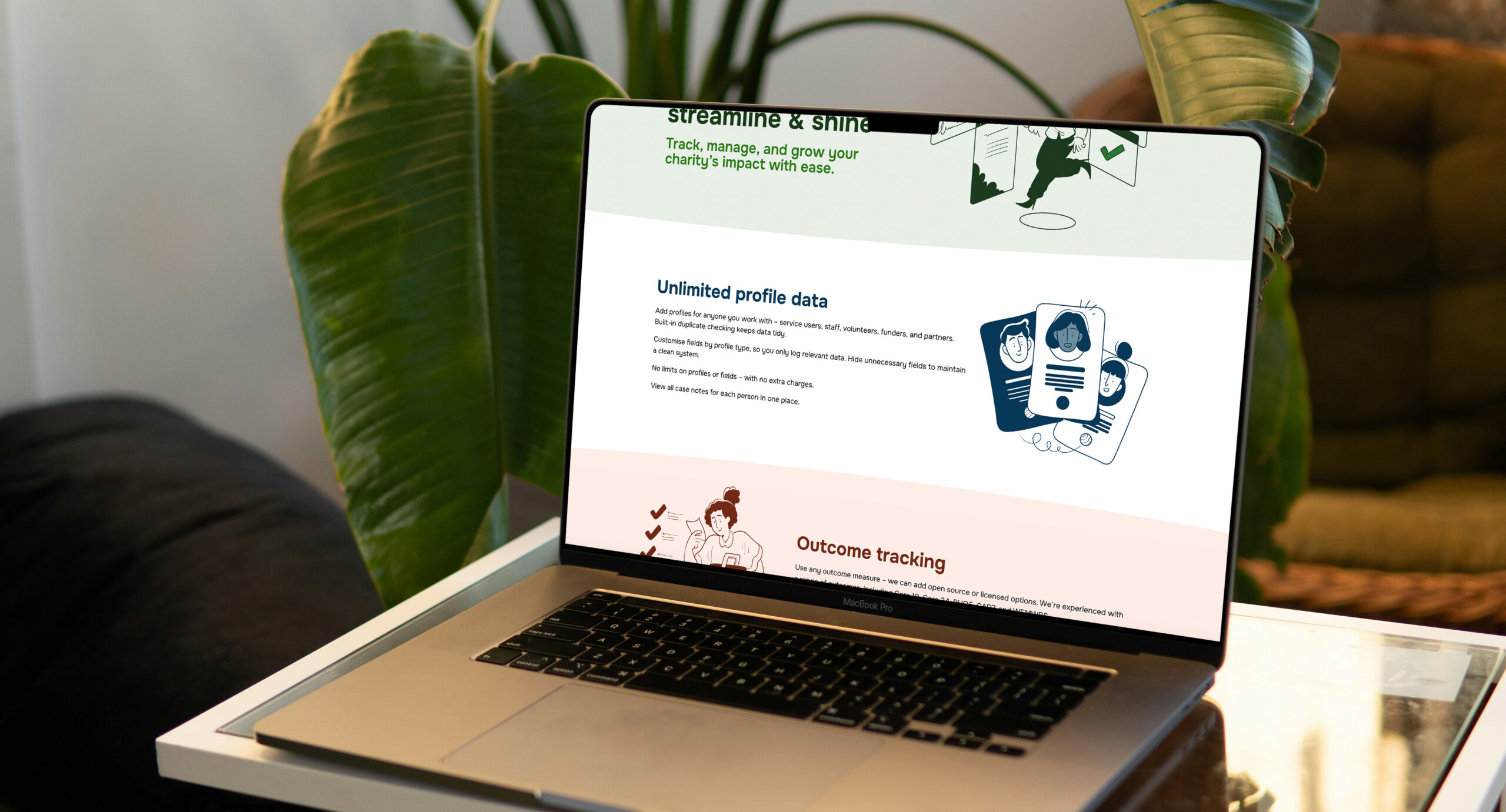
A modular website built for engagement and growth
We designed and built a bespoke WordPress website using a modular block system giving Lamplight the flexibility to adapt and expand their content over time.
Each sector page was tailored to resonate with a specific audience, making it easier for users to understand how Lamplight fits their needs.
A new visual pricing calculator simplifies complex package decisions, improving transparency and reducing support queries.
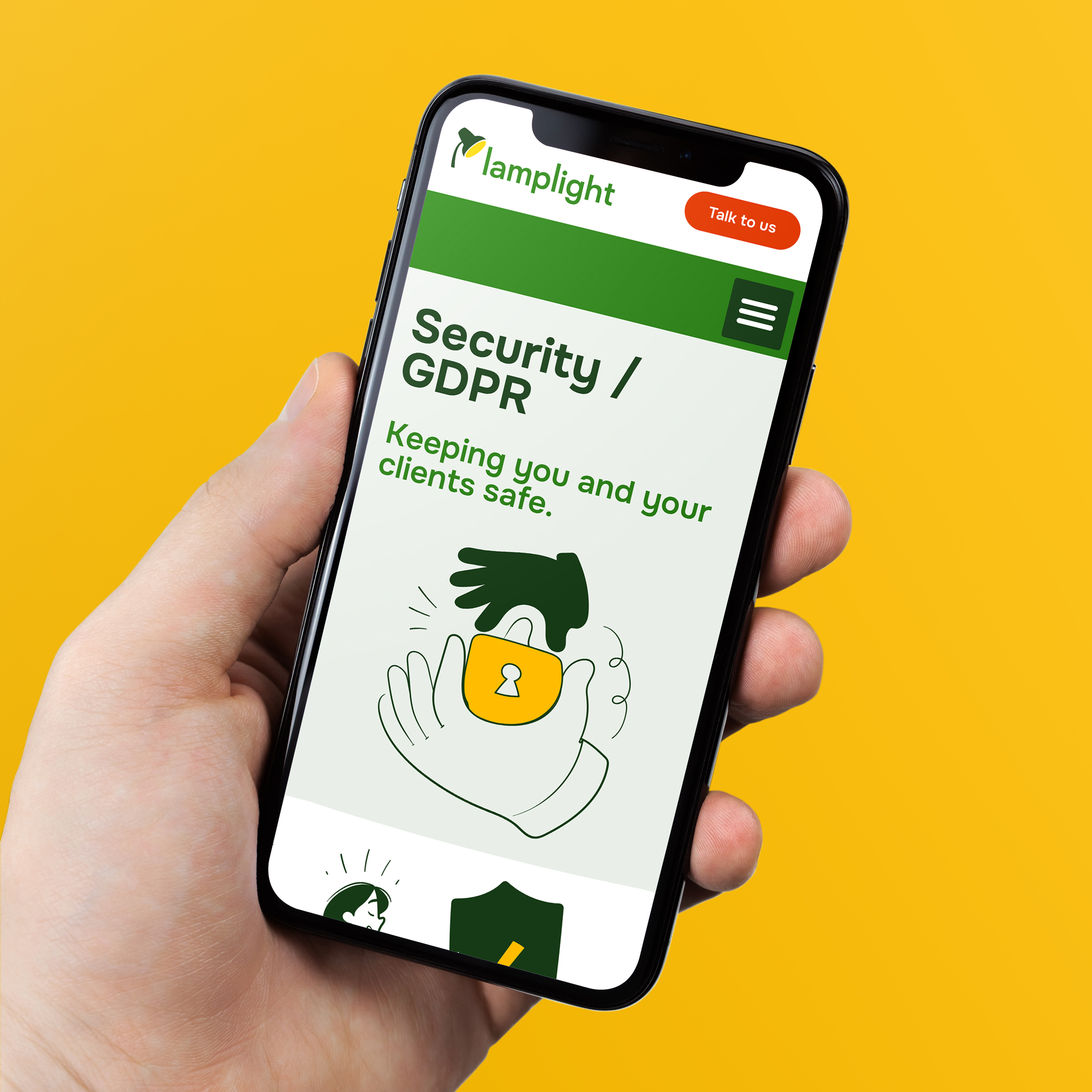
Illustration with heart
We commissioned a set of bespoke illustrations to bring warmth and personality to Lamplight’s brand. Designed in the new colour palette and visual style, they help explain key features and reflect the everyday work of charities.
Used across the website, product, and promotional materials, these illustrations support storytelling and strengthen recognition—while keeping things friendly, inclusive, and human.
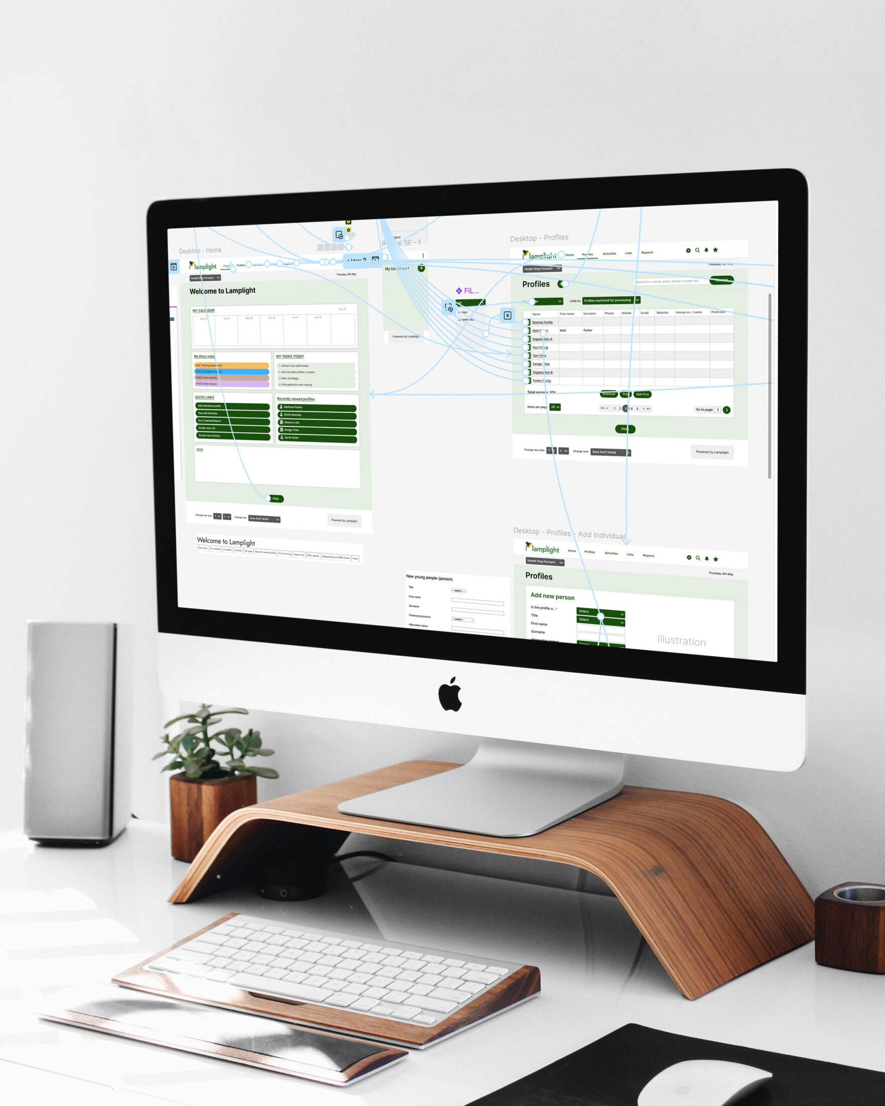
Improving the user experience from the inside out
As charities rely on Lamplight every day, it was essential that the software itself kept pace with users’ needs and expectations.
We audited key screens and user flows, identifying opportunities to simplify interactions, enhance usability and improve accessibility.
From clearer layouts to more intuitive navigation, our recommendations helped refine the interface — improving day-to-day use for teams on the ground.
“Design Tribe were a brilliant partner — creative, reliable, and thoughtful throughout. They took the time to truly understand our needs and delivered a brand and website that authentically reflect who we are.
The results feel polished and purposeful, and we’ve seen a clear rise in enquiries since relaunch.”
Matthew Parker, Director & Founder, Lamplight
Stronger visibility and credibility
Improved engagement across priority sectors
Increase in website enquiries
IMPACT
The refreshed brand has strengthened Lamplight’s position in the charity technology space, improved clarity of communication, and created a flexible foundation for future growth. The website now reflects the organisation’s expertise and ethos, helping charities feel confident in choosing a system designed for real-world impact.
Would your organisation benefit from modernising its’ brand and web? Get in touch and we will help you realise your vision.
Looking to modernise your brand and digital presence?